contact us

Use the form on the right to contact us.

You can edit the text in this area, and change where the contact form on the right submits to, by entering edit mode using the modes on the bottom right.

7614 Montgomery Avenue
Elkins Park, PA, 19027
United States

2157962955

Kelsh Wilson Design creates message-driven marketing communications, in print and on the web, for education, business, and nonprofits. Admissions / Advancement / Branding / Photography + Video

kelsh-wilson-design-print-pixels.gif

Blog

Print & Pixels: Kelsh Wilson Design's blog where we post our latest news and inspiration. Kelsh Wilson Design creates message-driven marketing communications, in print and on the web, for education, business, and nonprofits. Admissions / Advancement / Branding / Photography + Video


Fred's Thoughts: Why Print Supervision is Important

Fred Wilson

kelsh-wilson-design-process-press-fred.jpg

There is something unique and wonderful about a well-printed publication. To hold and read a piece that has been beautifully designed and been beautifully printed—especially if it has great photos—is to experience a powerful form of communication. And it’s one that still connects with people in this age of social media and multimedia.

When you see great printing, though, it’s easy to forget the work and skill that go into producing it. Technology today may be more powerful than ever, but printing remains as much an art as a science. It takes good judgment and great care.

All of which brings us to the topic of printing supervision, one of the least visible and most important steps in creating any kind of print communication.

The goal of print supervision is to maintain the highest quality throughout the process, from prep to ink on paper. It sounds simple, but things can wrong, even with the best printer. The printing process spans a complex series of steps from the initial handoff of digital files through printing, binding and finally shipping. And—to put it pessimistically—each of these steps presents the chance for a problem.

Yes, pages could get bound in upside-down and require a redo. But much more subtly, the result could fail to capture the look that the designer, photographer and client have worked so hard to achieve. By the time a job reaches the printer, our designers know how everything in it should look. They’ve worked closely with our client, getting input on issues such as accurate color use (perhaps school colors). Similarly, our designers and photographers have worked together to create powerful images. It takes precise directives to the printer to translate these through the four-color offset printing process and get the look we want.

It’s also important to realize that, while modern computer-controlled press can deliver remarkable results, they are not all-powerful. The designer and pressman are often faced with the need to compromise because of limitations inherent in offset printing. The key is to make these compromises wisely, keeping the vision for the finished piece clearly in mind. In reading through what I’ve written so far, I realize I’m probably making our whole staff sound a bit up-tight—obsessed with the finest nuances, worried over every possible sort of lapse. And I’m proud to say, that’s exactly how we are. We love beautiful results. We take the pains required to achieve them.


Kevin's Tips for Making your Photo Shoot Click

Fred Wilson

kelsh-wilson-design-kevin-monko-in-action.jpg

Taking great photos requires both strong creative vision and solid techincal skill, but it also requires the key to get into the lab wehre you were planning to get your research shot. In other words, by having someone on your team plan ahead and focus on a few details, we can assure better photos and more productivity on the day of the photo shoot.

Hence my thesis: It’s important to get all your ducks in a row.

What sort of ducks are we talking about? Here are a few examples:

• The password to activate a computer screen in a computer shot.
• The apparatus of a science experiment already properly assembled.
• Instructions to students on how to dress. (In a uniform? In a casual shirt? Not in a shirt with another school’s logo on the front
• Some art available in the art studio—works in progress or completed pieces that we can fake working on.
• A pre-scouted dorm room without offensive decorative content.

In short, it pays to think about every practical detail of every shot we need to get.
The most important of these details is probably the people. It helps immeasurably if you and your team are able to identify enthusiastic, expressive, cooperative students and teachers who are not reluctant to be photographed. This may sound silly, but it’s easy to get caught up in selecting people on factors such as balance among your academic departments and end up with someone who really does not want to take part.

Of course, bonus points are awarded for excellent bone structure, good hair, healthy skin, and athletic builds. We are not shooting fashion spreads here (generally). Nonetheless, this is a visual medium, and there’s no shame in putting your best foot (or face) forward.

As far as wardrobe goes, it’s generally a good idea to avoid wearing stripes, plaids, and prints, as well as the aforementioned shirts with logos other than yours. Black or white clothing is not ideal either, as it can lose detail in printing. Whenever possible, choose solid-colored clothing in medium tones (not fluorescent green). The idea here is to keep the focus on the subject or activity, rather than have the eye drawn to a garish color, clashing plaids, or an ad for Abercrombie and Fitch.

If this seems like a lot to remember, don’t worry. In advance of the shoot, we’ll have a call and talk through the details as they pertain to your project. On multiday shoots, we can also use some time up front to scout and plan for what’s to come.

Finally, it’s only fair to mention that we are perfectly comfortable breaking any of these rules, and do so on a regular basis.


Cabrini College / Admissions Publications

Fred Wilson

Viewbook

Viewbook

Outcomes Piece

Outcomes Piece

Travel Piece

Travel Piece

Kelsh Wilson Design recently created new Admissions marketing materials for Cabrini College. Because we felt that their core messages were still very valid, we refreshed the content and redesigned the pieces, updating the look and feel. The materials included an admissions viewbook, a travel piece, a campus map and information for visitors, and an outcomes piece featuring alumni success stories. This is the second full set of materials we have designed for Cabrini. 

Murray State University / Capital Campaign Case Statement

Fred Wilson

Kelsh-Wilson-Design-Murray-State-University-Case-Statement-1.jpg
Kelsh-Wilson-Design-Murray-State-University-Case-Statement-2.jpg
Kelsh-Wilson-Design-Murray-State-University-Case-Statement-3.jpg

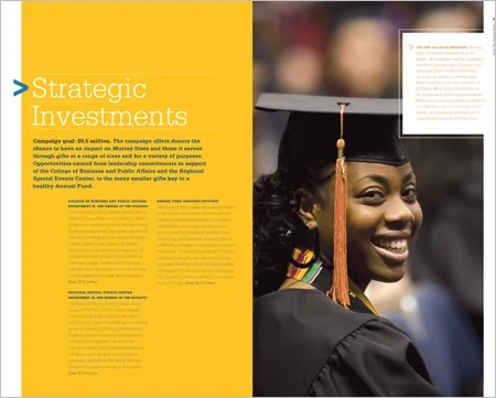
Kelsh Wilson developed the name, graphic identity, and case statement for a $60 million campaign for Murray State University in Murray, KY. Inspired by a line from the school’s alma mater, the campaign name, “Hold Thy Banner High,” resonated strongly with alumni. Because the campaign launched publicly amid recessionary economic news, the messaging focused strongly on support for students—the single largest campaign priority and one donors continue to recognize as vital. 

Malvern Preparatory School / Annual Fund

Fred Wilson

Kelsh-Wilson-Design-Malvern-Annual-Fund-1.jpg
Kelsh-Wilson-Design-Malvern-Annual-Fund-2.jpg

Malvern Prep, an independent, Catholic boys school in Malvern, PA, invited Kelsh Wilson to create fundraising materials that could help them reinvigorate their annual giving. Kelsh Wilson designed a series of illustrated letters from current donors, each letter representing a different constituent group—alumni, parents, and faculty. The letters featured colorful design, subject specific photos, and compelling editorial by Kelsh Wilson. In their first year in use, the letters assisted Malvern in achieving the most successful annual fund in recent history. 

Rutgers University / University Case Statement

Fred Wilson

Kelsh-Wilson-Design-Rutgers-University-Case-Statement-1.jpg
Kelsh-Wilson-Design-Rutgers-University-Case-Statement-2.jpg
Kelsh-Wilson-Design-Rutgers-University-Case-Statement-3.jpg

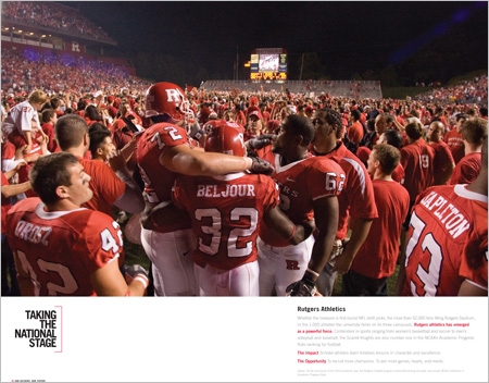
Designed as part of a comprehensive communication strategy for Rutgers University’s $1 billion campaign, Our Rutgers, Our Future, this publication offers clear and concise case for support to donors. The case includes sections explaining what the campaign is about and why donors should invest: a statement of vision, an outline of campaign funding purposes and goals, and a menu of general giving opportunities. It was supported through the compelling stories presented in the campaign Pride Book. 

Moorestown Friends School / Search Piece

Fred Wilson

Kelsh-Wilson-Design-Moorestown-Friends-School-Search-Piece-Cover.jpg
Kelsh-Wilson-Design-Moorestown-Friends-School-Search-Piece-1.jpg
Kelsh-Wilson-Design-Moorestown-Friends-School-Search-Piece-2.jpg

This multi-panel printed piece is a companion to a microsite on the MFS homepage, also designed by Kelsh Wilson. MFS faced the challenge of defining the value of an independent school education amidst a field of strong public schools, and a reluctance on the part of parents to learn more about independent schools. KWD commenced the project with focus groups including students and parents to learn about their enrollment experiences. Kelsh Wilson’s solution was to create a marketing piece and microsite that focuses on all the opportunities available to students at MFS that would not be accessible at public schools by speaking to the issues that most concern prospective families. 

Rutgers University / Pride Book

Fred Wilson

Kelsh-Wilson-Design-Rutgers-University-Pride-Book-1.jpg
Kelsh-Wilson-Design-Rutgers-University-Pride-Book-4.jpg

During an extensive message research phase for Rutgers University’s $1 billion campaign, Our Rutgers, Our Future, KWD heard numerous alumni express their pride in the institution and also the concern that the University’s accomplishments were not as widely recognized as they should be. This made the goal of engendering pride particularly important for Rutgers and for the campaign. KWD proposed an approach that was somewhat different: collecting that spirit into a single volume, separate from the details of the campaign. Each page or spread in this volume tells a single story and each story is short and simply stated with striking photography.

The College of William & Mary / Outcomes Piece

Fred Wilson

Kelsh-Wilson-Design-College-of-William-and-Mary-Outcomes-Brochure-1.jpg
Kelsh-Wilson-Design-College-of-William-and-Mary-Outcomes-Brochure-2.jpg

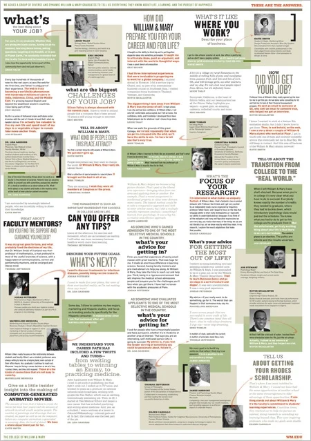
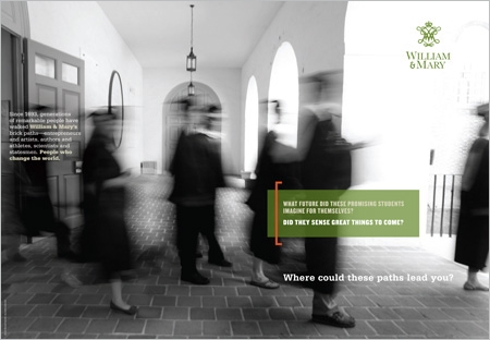
When the admissions staff at William & Mary decided they wanted to highlight the accomplishments of their alumni—famous, historical, and talented—they turned to KWD as a partner in the project. Senior Writing Consultant, Mike Butler interviewed a broad range of alumni and created a question and answer format that KWD designers used to create an infographic poster. The quoted alumni range from satirist Jon Stewart to William & Mary’s most famous alum, Thomas Jefferson. The poster, which features a black and white photo on the reverse side, was created as a piece to distribute during campus visit days. 

SUNY Oneonta / Admissions Materials

Fred Wilson

Viewbook

Viewbook

Admitted Student Piece

Admitted Student Piece

Travel Piece

Travel Piece

This summer we completed a new set of admissions materials for SUNY Oneonta. After 15 years partnering with the college, we had a good understanding of the school, but to refresh our insights into why students continue to choose Oneonta, Senior Writing Associate Mike Butler conducted a series of focus groups to help shape the new materials. The focus groups included a review of admissions publications from various institutions (some designed by KWD, some designed by others) to get a good sense of what appeals to the Oneonta student audience. The new suite of materials were developed using the students' responses. The pieces are colorful, eye-catching, and energetic, featuring strong photos and short, supporting text. They present student profiles and alumni success stories along with key facts about the school, allowing prospective students a glimpse of the Oneonta experience. 

Bryn Mawr College / Annual Fund

Fred Wilson

Kelsh-Wilson-Design-Bryn-Mawr-College-Annual-Fund-Mailer-Cover.jpg
Kelsh-Wilson-Design-Bryn-Mawr-College-Annual-Fund-Mailer-BuckSlip.jpg
Kelsh-Wilson-Design-Bryn-Mawr-College-Annual-Fund-Email-Blast.jpg

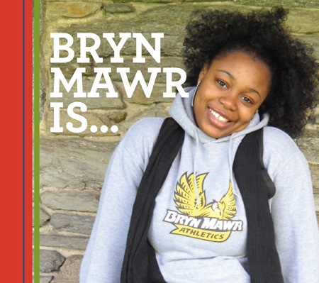
Bryn Mawr College invited Kelsh Wilson to produce a series of annual fund pieces that included a folding card, several inserts, an invitation and welcome to their higher level giving society, and graphics for use with email solicitations. The intent of the pieces was to carry a theme—a look and feel—throughout the year that allowed donors to better identify the pieces with the Annual Fund. Using editorial provided by the College, the pieces tell the stories of students and faculty impacted by gifts to the annual fund. The pieces were created using a colorful palette that coordinated with Bryn Mawr’s new identity.

The Perkiomen School / Admissions Materials

Fred Wilson

viewbook

viewbook

introductory brochure

introductory brochure

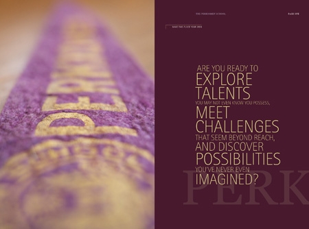
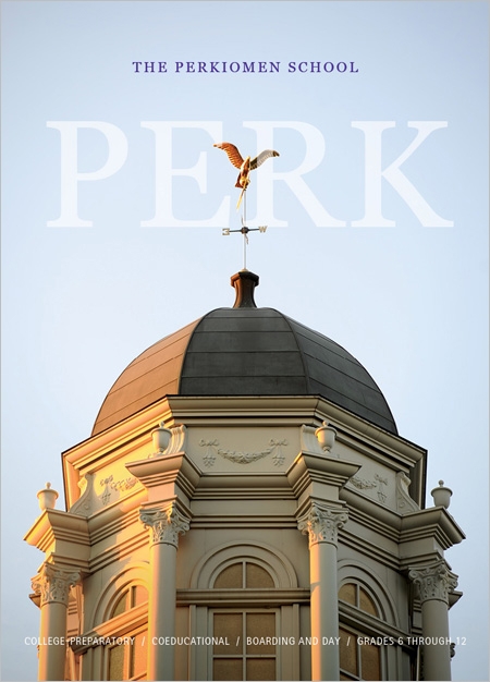
The Perkiomen School invited Kelsh Wilson to redesign their suite of admissions materials in an effort to both update the information and to bring added visibility to their middle school. Starting with a series of interviews and focus groups that built upon their most recent identity redesign, KWD team members created beautiful publications that are warm and welcoming, creating a compelling case for the school's academic qualities. Content decisions included featuring bold statements of educational philosophy or institutional strengths presented in elegant, expressive type. The program features a viewbook, an introductory brochure, and a middle school brochure. Additional pieces that are currently in production include an athletics brochure, an arts brochure, and a brochure for The Learning Center.